If you’ve ever walked past a trendy café, a boutique retail store, or a creative studio and glanced at their wall-mounted neon sign, you’ve probably noticed the difference a well-chosen font makes. Too often, when businesses come to me as their Text Acrylic Neon Signs supplier, they get caught up in the glow, the color, and the size—then pick a font that looks great on a website mockup, only to realize it feels unreadable, mismatched, or even off-brand once installed on their wall. After 7 years crafting custom neon signs, I’ve seen every font misstep imaginable: a tiny serif font for a busy shopfront that no one can read from the sidewalk, a overly playful script font for a law firm that feels unprofessional, and a thin monospace font that blurs when lit up at night. Today, I’m breaking down the practical, science-backed steps to choose the right font for your text acrylic neon sign, straight from the workshop floor. Text Acrylic Neon Signs
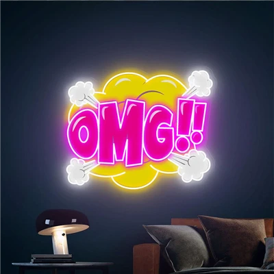
First, let’s ground this in how neon signs work—because they’re not just printed text. Acrylic neon signs (the modern, energy-efficient alternative to glass tube neon) use LED strips behind clear or frosted acrylic, with laser-cut letters that glow from the edges. That means every font choice has to account for light diffusion, contrast, and how the eye processes text when lit. Unlike a book or a website, people rarely read a neon sign word-for-word; they glance at it, often from a distance, while walking, driving, or moving through a space. That means readability isn’t just about clear letterforms—it’s about how the font performs under specific lighting conditions and in its intended environment. I always start with the core question clients avoid first: Where will this sign live? Is it a shopfront sign visible from 50 feet away at street level? A wall sign inside a café where guests stand 3 feet from it to order? A bedroom sign that’s a decorative focal point 2 feet from a bed? The answer to that single question eliminates 90% of bad font choices before you even scroll through font libraries.
Let’s start with distance, the biggest factor for neon sign readability. If your sign is for a storefront with a 50-foot viewing distance, you need a font with extremely distinct, open letterforms. Letters like O, C, and S should be fully closed enough to not blend together, and gaps between strokes (called counters, if you’ve ever dabbled in typography) should be large enough that light doesn’t seep through and merge adjacent letters. For example, a condensed sans-serif like Arial Narrow might look sleek, but its tight counters make the “e” and “a” almost unreadable from a distance when backlit. I learned this the hard way 5 years ago when a local bakery ordered a 3-foot-wide neon sign with Arial Narrow for their shopfront. When installed, the “b” and “d” blended into a blurry mess of light—customers walked past wondering if the bakery’s name was “Bake” or “Bakee.” We had to re-cut the letters in a wider, more open font (Helvetica Neue Bold, in a 12-inch height for that 50-foot distance) and that fixed it immediately. The general rule here, per typography and signage design guidelines, is that for every 10 feet of viewing distance, your text height needs to be 1 inch. So a sign for 50 feet needs at least a 5-inch minimum letter height, and that height is non-negotiable if your font has tight counters.
Next, contrast between stroke weight and background. Neon signs don’t have a white paper background—your background is the wall, which could be brick, painted wood, concrete, or even glass. The font’s stroke weight (how thick or thin each letter’s lines are) has to contrast sharply with that background, especially for lit acrylic neon. Thin strokes, like those in a light weight of Helvetica or a delicate script, can get lost against dark, textured walls. I once helped a photographer choose a sign for their studio wall, which had exposed concrete with a rough, dark gray finish. They loved a delicate cursive font for their business name, but when we tested a sample cut, the thin strokes vanished into the concrete’s texture—you could barely see the glow. Swapping to a medium-weight sans-serif (Montserrat Medium) gave the thick enough strokes to pop against the concrete, and the subtle curve of the Montserrat family kept it feeling warm, not blocky. For dark backgrounds, avoid any font with strokes thinner than 2mm when cut for neon—any thinner, and the light will soften the edges too much. For light backgrounds, you can get away with slightly thinner strokes, but still aim for at least 1.5mm to maintain legibility.
Now, font category: sans-serif, serif, script, or display. Each works for neon, but only if paired with the right use case. Let’s break them down one by one, with real examples from my supplier portfolio. Sans-serif fonts are the most reliable for neon signs, period. Their clean, unadorned strokes don’t have tiny serifs (the little feet on the ends of serif letters) that can blur when lit, and they read well at almost any distance. Montserrat, Open Sans, and Helvetica Neue are my go-to sans-serifs for 90% of client projects. I recently did a sign for a yoga studio that uses Montserrat Light for “OM” and Montserrat Bold for the studio name; the contrast between light and bold keeps it interesting without sacrificing readability, even from the sidewalk. Serifs have a more classic, formal feel, but they work best for smaller neon signs or those with a vintage vibe. Avoid old-style serifs with tiny, delicate serifs—stick to slab serifs, like Rockwell or Courier Bold, which have thick, stable serifs that don’t blur when lit. I did a vintage diner sign last year using Rockwell for the diner’s name, and the thick serifs added to the retro charm without making the text hard to read. Script fonts are the trickiest, but they can work if used carefully. Reserve script for decorative text only—never for primary business names on a storefront. Script fonts have connected letters, and those connections can blur when light seeps through, making names unreadable from a distance. I only use script for taglines, like “Good Vibes Only” on a small wall sign, not for the main business name. And even then, choose a script with distinct, not overly elaborate strokes—avoid fonts with swashes or loops that add extra width and can merge together. Display fonts are bold, stylized fonts (like Impact, Bebas Neue, or Circus) that work for a fun, eye-catching look. They’re great for small, personal signs (bedrooms, game rooms) where readability from a huge distance isn’t needed, but can feel cheesy or unprofessional if used for a corporate or retail sign that needs to convey trust.
One detail that almost no one thinks about: letter spacing (tracking) and word spacing. This is where most neon sign font choices go wrong, even when you pick the right font. Neon text glows, so adjacent letters can blur into each other if they’re too close. For acrylic neon signs, I always add extra tracking (letter spacing) of 5-10% of the letter height, depending on the font. For example, if your letter is 6 inches tall, add 0.3 to 0.6 inches of space between each letter. If you’re using a script font, add even more—up to 15%—because connected letters can merge when lit. Word spacing is just as important: leave at least half the height of a letter between words, so words don’t run together when the sign is on. A client recently came to me panicking because their neon sign for a café’s patio had text that looked like one long blur. We checked the font, and they’d used the right sans-serif, but they’d set tracking to 0—they’d kept the letters as tight as they would for a printed poster. Adjusting the tracking to 8% fixed the blur instantly. I always tell clients to request a sample test of the letter spacing before finalizing any font choice—we can cut a small 2×2 inch sample of the actual font with our neon process, so they can see exactly how the letters look when lit, not just on a digital mockup.
Another science-backed consideration: light diffusion and acrylic thickness. Wait, you’re probably thinking—this is about font, not materials. But font choice interacts with how the neon light diffuses through the acrylic. Clear acrylic makes light brighter and sharper, while frosted acrylic softens the glow. If you’re using clear acrylic (for a bold, sharp look), a font with sharp, distinct edges works great—sans-serifs with clean lines. If you’re using frosted acrylic (for a softer, more ambient glow), avoid fonts with tiny, tight details; those details will get lost in the frosted diffusion. For example, a thin, detailed display font will look blurry on frosted acrylic, so switch to a bolder sans-serif or slab serif to keep the text legible. I also recommend 3mm acrylic for most signs—thinner acrylic (1.5mm) can warp slightly when lit, which makes letter edges uneven, while 5mm is overkill for most projects and adds unnecessary weight and cost.
Let’s address common myths that I hear every week as a supplier. Myth 1: “My brand uses a fancy cursive font, so I have to use it for my neon sign.” No—your brand font is designed for printed materials, websites, or business cards. Neon is a different medium, so you can adapt the vibe of your brand while keeping it readable. For example, if your brand uses a flowing script for social media, you can choose a sans-serif font with subtle curves (like Montserrat Italic) that has the same warm, approachable feel but works for neon. Myth 2: “Bigger is always better.” No—if you have a small wall sign (1 foot wide), a font that’s too big will feel awkward and unbalanced. The size of the sign should dictate the font height, not the other way around. Myth 3: “Any font will look good in neon.” I’ve had clients show me a font with 10 different line weights and say “Can we use this?” The answer is almost always no—only the boldest, thickest line weights work for neon. Thin line weights will disappear when lit, as we learned with the delicate cursive for the concrete studio sign.
Now, let’s walk through a real client scenario to put this all together. Last quarter, a local independent bookstore came to me for a neon sign for their front window. Their core brand values are cozy, literary, and welcoming, so they didn’t want a cold, blocky font—but they also needed the sign to be readable from the sidewalk, 30 feet away. First, we calculated the required letter height: 30 feet / 10 feet per inch = 3 inches minimum. They wanted the sign to say “Page Turners Bookshop” plus a tagline “Where Stories Begin.” We started with font category: sans-serif or slab serif? We tested Rockwell Slab Serif, but its thick serifs felt too retro for their literary brand, so we tried Montserrat Semi-Bold. It had the subtle, approachable curves they wanted, and the bold stroke weight was thick enough to contrast with the dark brick storefront. Next, spacing: their letters would be 3.5 inches tall (for a little extra readability at 30 feet), so we set tracking to 10% of 3.5 inches = 0.35 inches between letters, and word spacing to 1.75 inches between words. We did a small sample test of the font with our 3mm clear acrylic and warm white LED strip, and they loved it—no blurring, it popped against the brick, and it felt warm and inviting, just like their bookstore. We delivered the sign a week later, and they sent a photo of a group of high schoolers pointing at it from across the street, asking where the bookstore was. That’s the win— a font that works for the medium, the environment, and the brand.
If you’re still stuck, here are three quick checks to narrow it down: 1. Stand where your neon sign will be viewed from (or ask someone to stand there, if you can’t be there) and squint at a digital mockup of your text. If you can make out the letters even when squinting, it’s probably a good font. If it blurs into a line, it’s time to pick something else. 2. Match font vibe to your space: formal spaces (law firms, corporate offices) stick to sans-serifs or slab serifs; fun spaces (cafés, game rooms) can try a playful display font or script for taglines; vintage spaces (retro diners, 90s-themed bars) work with slab serifs or classic scripts. 3. Test before you commit: reputable neon sign suppliers (like my team) will provide a small, low-cost sample of your font choice, lit up, so you can see exactly how it looks before cutting the full sign.

At the end of the day, a great neon sign does two things: it communicates your message clearly, and it evokes the feeling you want customers to have when they see it. Choosing the right font isn’t just a design exercise—it’s a balance of typography science, environment, and brand identity. As your Text Acrylic Neon Signs supplier, I’ve seen that the best signs aren’t the ones with the fanciest fonts or the brightest glow—they’re the ones that people can read, remember, and associate with your brand for all the right reasons. If you’re ready to design your custom neon sign, we’re here to walk you through every step, from font selection to final delivery, to make sure your sign is perfect for your space.
Neon Signs for Bedroom References
- Meggs, P. B., & Purvis, A. W. (2015). Meggs’ History of Graphic Design (6th ed.). John Wiley & Sons.
- Signage Design Basics: Best Practices for Readability and Accessibility. (2022). International Sign Association.
- Tufte, E. R. (1990). The Visual Display of Quantitative Information. Graphics Press.
- Neon Sign Design Guidelines for Commercial Spaces. (2021). American Institute of Graphic Arts (AIGA) New York Chapter.
- Typography for Environmental Design. (2019). Rockport Publishers.
Qianxin Meichen Optoelectronic Technology (Huzhou) Co., Ltd.
As one of the most professional text acrylic neon signs manufacturers and suppliers in China, we also support customized service. With abundant experience, we warmly welcome you to buy bulk cheap text acrylic neon signs in stock here from our factory. Quality products and low price are available.
Address: 3rd Floor, Building 4, Zhejiang Jiacheng Science and Technology Entrepreneurship Park, No. 656 Qixing Road, High-tech Zone, Wuxing District, Huzhou City, Zhejiang Province
E-mail: David18888@gmail.com
WebSite: https://www.china-neonsigns.com/
